Before we had high speed internet or even really much access to preview materials other than tiny screenshots in magazines, cover art was what sold games to us throughout the '90s and even most of the early 2000's. If a game had a cool cover, that was what sold us on trying it. So, let's take a look at some of the best that RPGs both old and new had to offer.
Now, keep in mind that these aren't all the boxes I like, nor am I saying these are the best of the best by any means. They're just a few of my personal favorites I felt like taking about for a bit.
Actraiser (Quintet, 1991)

It's certainly a simple but striking piece of imagery; the Egyptian pyramids and a roaring lightning storm right behind them. However, it's also a subtle hint that your godly powers can uncover secrets during the building segments - if you unleash an earthquake once the pyramid is uncovered or hit the Northwall temple with lightning, the villagers will fear your wrath and give up extra lives they have hidden away.
Dark Cloud 2 (Level-5, 2003)

You can tell that Dark Cloud 2 is going to be a major tonal shift from the first just from a glance at the box. While the first game had moody lighting, a grim setting and an overall dark atmosphere, Dark Cloud 2 is bright and upbeat, with vibrant colors and more whimsical character designs. It even shows off a lot of the themes - combat of course, but also item crafting, traveling the world via a flashy train, rebuilding towns with a wonderfully bizarre flying contraption, and even one of the first boss battles you face. Great game and an excellent cover to go with it.
Deus Ex (PC, 2000)

Developed at Ion Storm and helmed by Warren Spector, Deus Ex is an absolute classic, with a dark conspiracy-laden story, an excellent soundtrack and deep gameplay that's almost entirely open-ended and very moddable, making it extremely replayable. The box art is also fantastic, contrasting JC as the ray of light for humanity against a dark city with black helicopters flying through it. It's even better if you can find an actual box, too, as they used shiny silver foil for the backdrop.
Diablo (PC, 1996)

It was a bold choice to show the final boss right on the cover, but when the game itself literally bears his name, I suppose it's unavoidable. They did it in a pretty ingenious way, though - all you see is some of his face leering at you through a deep blackness lit up by fiery letters. It instills a sense of looming horror even before you put the disk in the drive and get immersed in its heavy atmosphere and eerie soundtrack.
Fallout: A Post Nuclear Role Playing Game (Interplay, 1997)

Fallout's cover tells you everything you need to know in one simple image. A city ruined by a nuclear blast, a rusted-looking box showing that whatever's still standing is pretty run-down and grimy, and an ominous red sky showing that you're stepping into a desolate and hostile world, with the only thing that looks shiny and new being some sinister-looking Atomic Age powered armor. Almost every later game in the series would have covers following in the same mold, but the OG gets the point for being so striking. I still think it looks the nicest of all of them, too.
Final Fantasy VII (Squaresoft, 1997)


One uber-strong swordsman standing defiant against the evil monolithic megacorporation and their symbol of power. Simple, indelibly iconic, and a perfect show of how this game stepped apart from its predecessors into a bold new world of science-fantasy. So much so that they knew not to mess with it when the remake rolled around over two decades later.
Fountain of Dreams (Electronic Arts, 1990)

Fountain of Dreams promised a lot - a spiritual sequel to Wasteland that would have taken place in a gang-run Florida where genetic mutations were slowly turning the populace into bizarre beasts. But like most EA releases, it takes a great idea and buries it beneath sloppy, half-baked gameplay and a hugely dumbed-down storytelling experience owing to major portions of planned content being left on the cutting room floor by an extremely rushed production schedule. Regardless, this cover is a beauty. A haunting image that tells a story in itself, and gets you interested enough in the game to try it out in spite of its serious flaws.
Grandia III (Game Arts, 2006)

The US box art of Grandia III is nothing special, but I love the Japanese cover. It's perfect, really. It shows off the style shift - the previous games in the series were in more of a cartoony anime style while this one goes a bit more for 3D realism. It shows off all the major characters in the story, and Yuki's plane - a major story point for the game - blasting off into the clouds. Even has some nice, poppy colors to match the aesthetic of the game, which is a stark contrast to the dreary tone of the US one. Who signed off on this being changed?
The Guardian Legend (Compile, 1989)

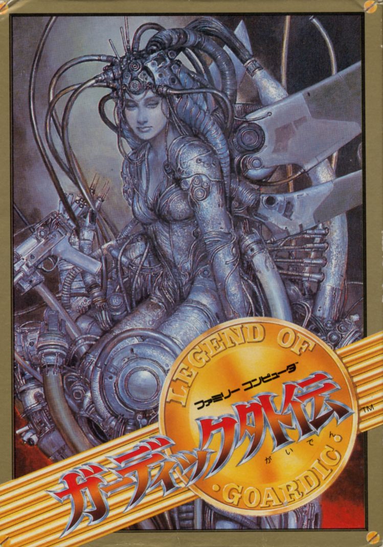
The US cover for Guardian Legend is pretty forgettable (in fact, it pretty blatantly rips off the poster for the 1985 movie "Creature"), but the European cover is pretty great-looking. Seemingly inspired by the art of Hajime Sorayama, who very much has a thing for chrome robot animals and gynoids (not all of which are work-safe, so be careful searching), it's a pretty fantastic representation of the Guardian as she embarks on her quest to infiltrate and destroy Naju. The Japanese cover by Naoyuki Kato is quite a beauty too, though with a bit more of a dark and slightly twisted feel to it. Either way, it's two unique depictions of a cool character that capture your imagination and make the journey you're undertaking that much more epic.

Judgment (Ryu Ga Gotoku Studio, 2019)

Judgment is a spinoff of the Yakuza franchise and has a much darker tone, with little to none of the tongue-in-cheek humor that made the series famous. The cover is simple, but eye-catching- the game's protagonist and his reflection in shattered glass, showing that some manner of violence took place to drive him to the dark place he spends much of the game in, trying to make things right through his own code of honor.

Zelda is a quintessential franchise, but oddly enough the cover art never really did a lot for most of the games; generally it's just the game's logo without much else going on. Link's Awakening's remake is a definite exception, though. Seeing the art style of the original Game Boy game come to life in 3D right on the package was proof enough that they'd do right by one of my favorite games in the series. It's perfectly framed too, with Link at the bottom, the Wind Fish's egg at the top and the logo in the center, adding some seagulls and palm trees as a nice thematic touch. Great cover to a solid remake of an incredible game.
Might and Magic IV: Clouds of Xeen (New World Computing, 1992)

There's just something about a magical floating castle in a bubblegum-pink sky juxtaposed against a sinister-looking skeleton wizard and his dragon that's awesomely playground; like Skeletor's invading the land of Equestria or something. It also fits perfectly well with the tongue-in-cheek tone of the series, letting you know it's meant to be good, silly fun and not the least bit pretentious.
Ni no Kuni II: Revenant Kingdom (Level-5, 2018)


Ni no Kuni II has several depending on the version you buy, but all of them are great. They capture the theme of the boy king and the lead character of the U.S. president (it's... complicated), they all have some very nice color work fitting the storybook theme, and they show off what your work ultimately will produce if you stick with it - a sprawling kingdom and a vast army to fend off the world's evils. It may not have the same Ghibli charm as the original, but it's Level-5 showing off what they do best.
The Outer Worlds (Obsidian, 2019)


Straight from that strange era where the box art would be very westernized but the in-game graphics would still be in an anime style, completely untouched from its eastern counterpart. Nevertheless, there are several recognizable elements here if you've played it - two of the protagonists (though Rolf wields a sword in-game, not a rifle), a few of the enemies you encounter, and Mother Brain, though they took her name very literally here; she's not actually a giant brain in the game. It's like they just passed along a vague description to someone who illustrates science fiction novels for a living and this is what they got back.
Ultima IV, V and VI (Origin Systems, 1986, 1988, 1990)


Ultima is a classic and groundbreaking series, with practically every game in it laying new groundwork for countless others to follow. The second trilogy in the series encapsulates that perfectly, taking storytelling in surprising new directions very different from the standard "beat the bad guy" fare, and the box art is just as epic as the games themselves. They give you a hint of what's to come without telling you the exact context of what they're depicting, and like the Atari art of old, they give the games a truly monumental feel in spite of their limited graphical technology. I like VI's in particular because of the big twist that game has; I won't give it away, but suffice to say you'll be looking at that cover in a very different way before the end. Amazing games and great art to go with them; Denis Loubet is king.

One of the granddaddies of all digital RPGs, it was a big hit in its time and a major inspiration to numerous other franchises that would become major hits in their own right, including Dragon Quest, Final Fantasy, Might and Magic and the Bard's Tale. The original cover is just as classic, with a texture resembling a book cover and embossed foil used for the text and the dragon logo on the front, showing that you're embarking on a journey worthy of a high-profile book printing.

A grim but surprisingly awesome image, portraying a face of one of the aliens that have conquered earth made entirely out of human skulls; a grim reminder of the genocidal campaigns and twisted genetic experimentation they're secretly carrying out on the populace throughout the game. Some early boxes for the game also had a lenticular cover that, when tilted, would fade from a live alien face to the skull collage; call it cheesy if you want, but I always love gimmick covers like those.